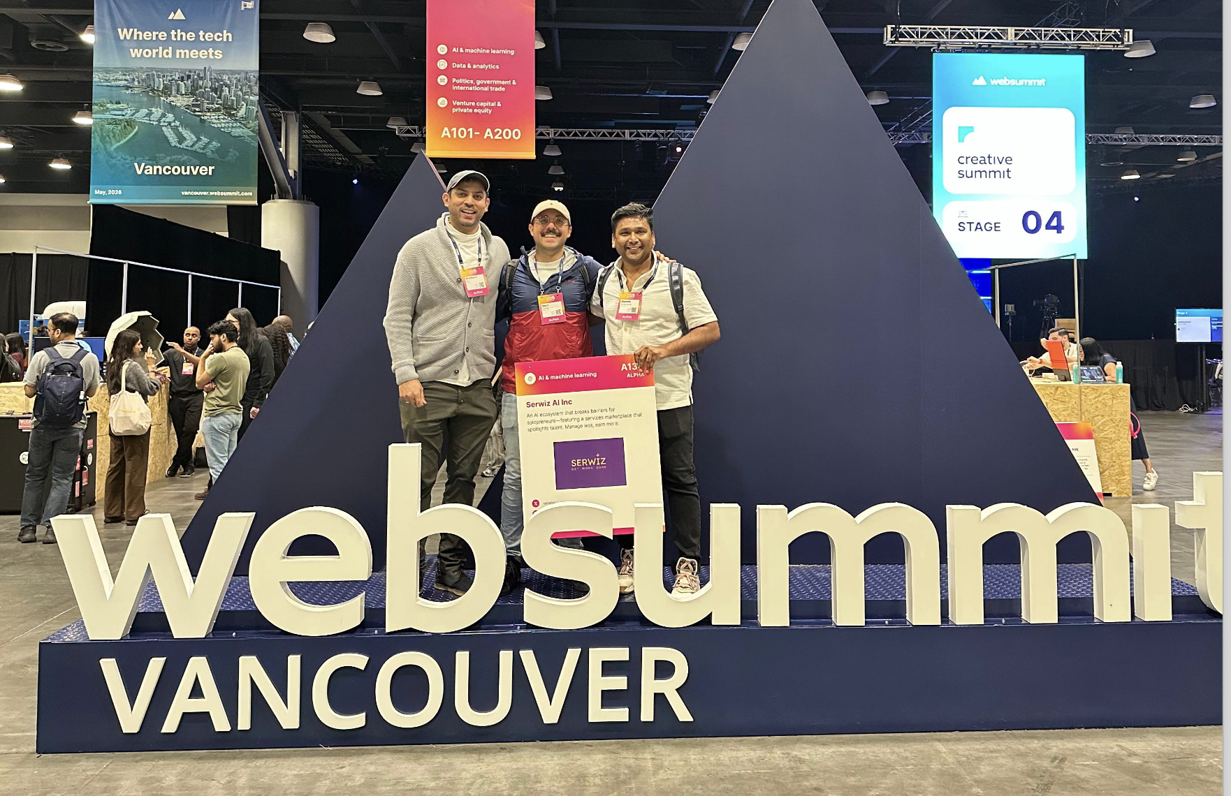
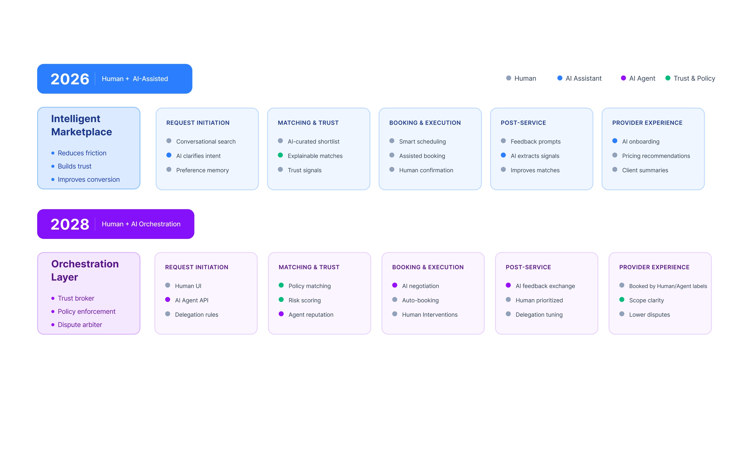
Serwiz is the services marketplace with a fully integrated, end-to-end booking infrastructure, powered by AI. It delivers a seamless user experience, instantly connecting users with the right professionals while empowering providers to thrive. At its core, Serwiz AI, a digital concierge that learns each user’s preferences, context, and past interactions to provide precise, real-time matches, making every interaction smarter, and more meaningful.
Provider-Centric Digital Tools
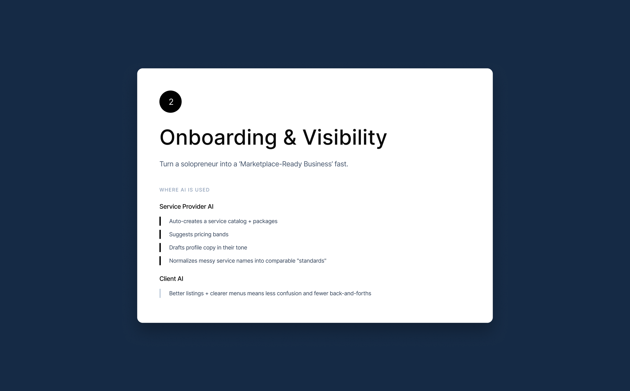
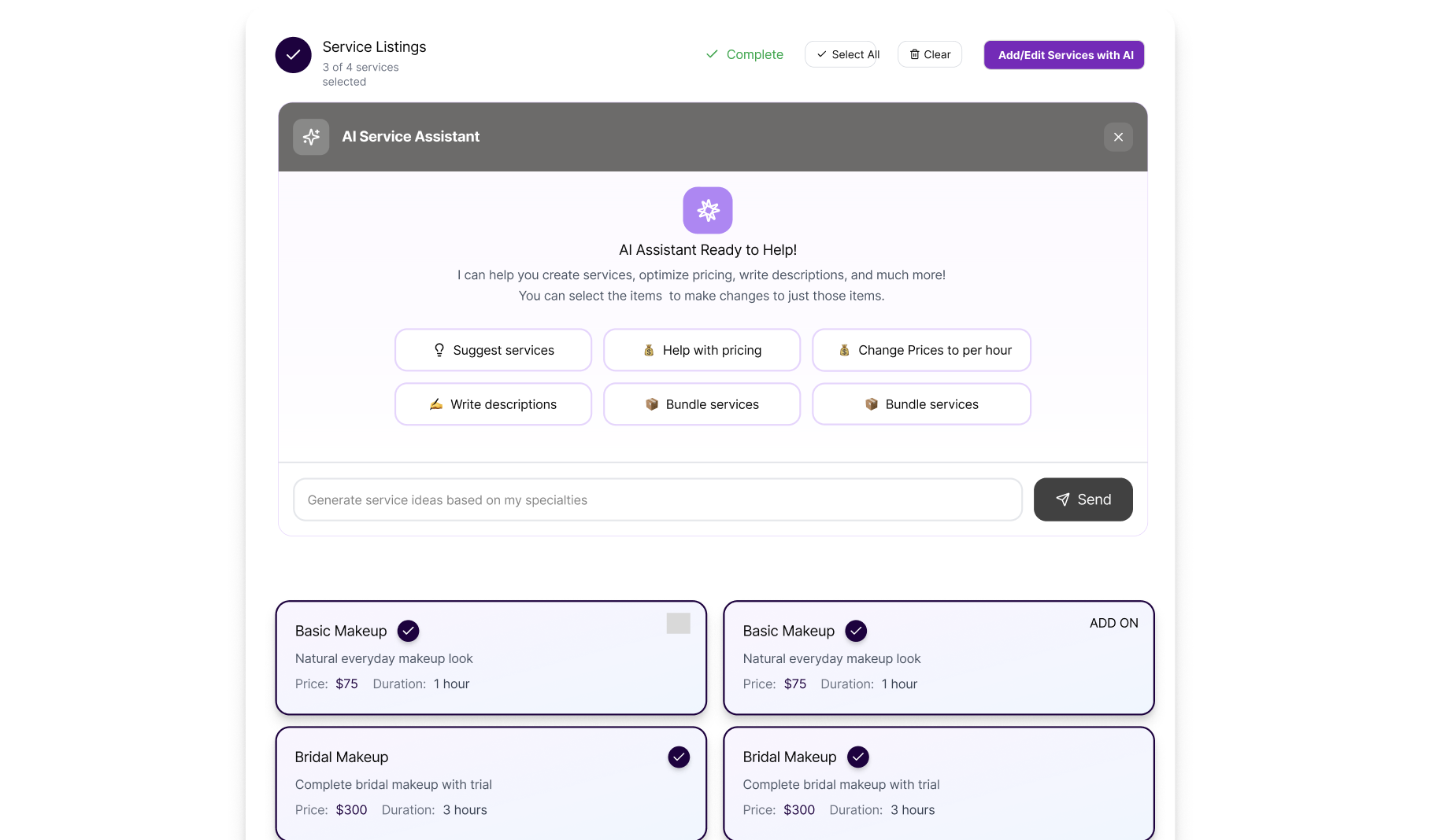
For providers, Serwiz is a business coach in a box: automated scheduling, AI-driven pricing recommendations, and user-friendly client management. We drastically reduce friction, overhead costs, and reliance on high-risk lead-generation models, enabling providers to grow their businesses in a single, intuitive ecosystem.
Unified, Scalable Marketplace
Instead of jumping among half a dozen apps, users can hire any local service, from plumbing to piano lessons, directly through Serwiz. This one-stop approach unleashes powerful network effects: satisfied consumers rebook more often and for more services, and providers benefit from repeat clients and cross-category visibility.
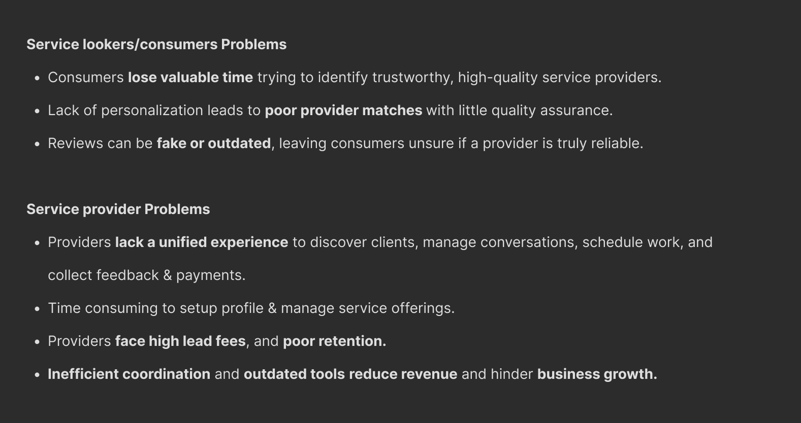
While Serwiz’s MVP validated the business vision, it surfaced critical usability and experience gaps that hindered user adoption and repeat usage. Users struggled to understand the booking flow, trust signals were unclear, and providers faced friction in onboarding and day-to-day operations. The product’s intelligence and value were present. but not yet felt by users. The goal was to realign the experience with Serwiz’s core value proposition: effortless service discovery, intelligent matching, and provider empowerment.
My Role - As the UX Designer, I led the effort to identify, prioritize, and resolve these experience gaps across the end-to-end marketplace. My responsibility was to translate Serwiz’s ambitious AI-powered promise into intuitive, human-centered interactions that worked equally well for consumers and providers. I partnered closely with product, engineering, and stakeholders to:
Audit the MVP to uncover usability breakdowns and adoption blockers
Reframe complex AI and marketplace logic into clear, user-friendly flows
Redesign core journeys including discovery, booking, onboarding, and provider tools.
Establish scalable UX patterns and Design System to support future categories and growth
Serwiz.ai’s Old State & It’s Challenges
Understanding the Problem Space

Case Study Examples that helped shaped Serwiz UX
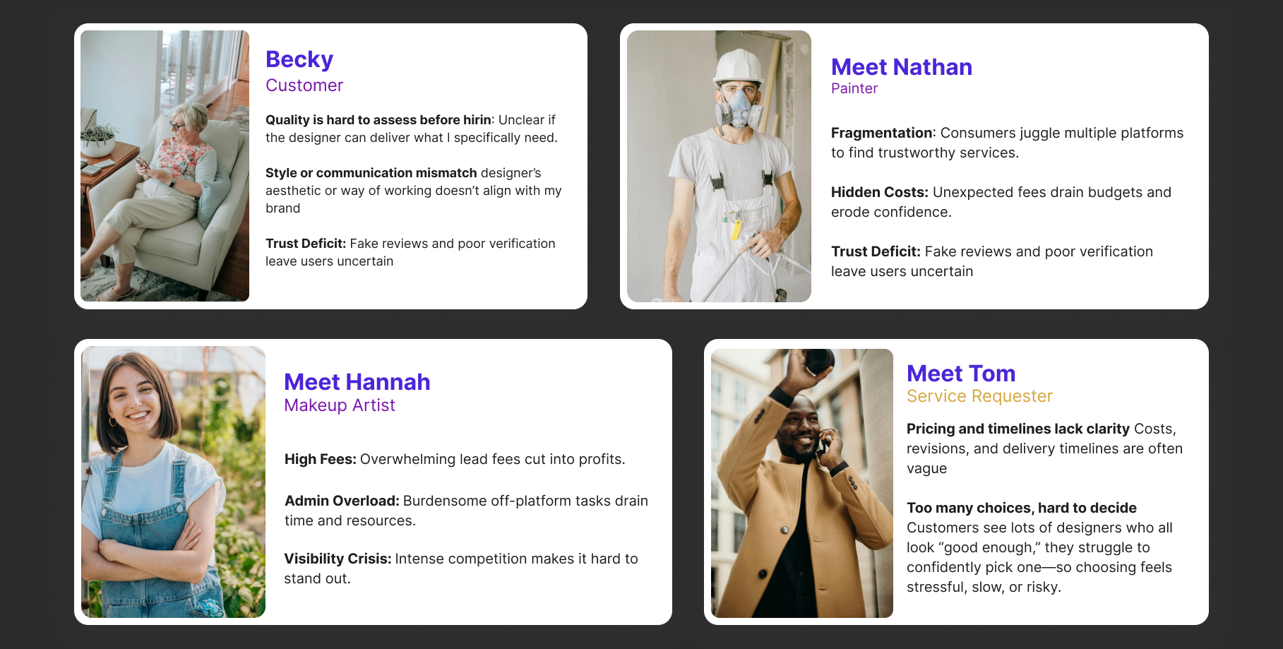
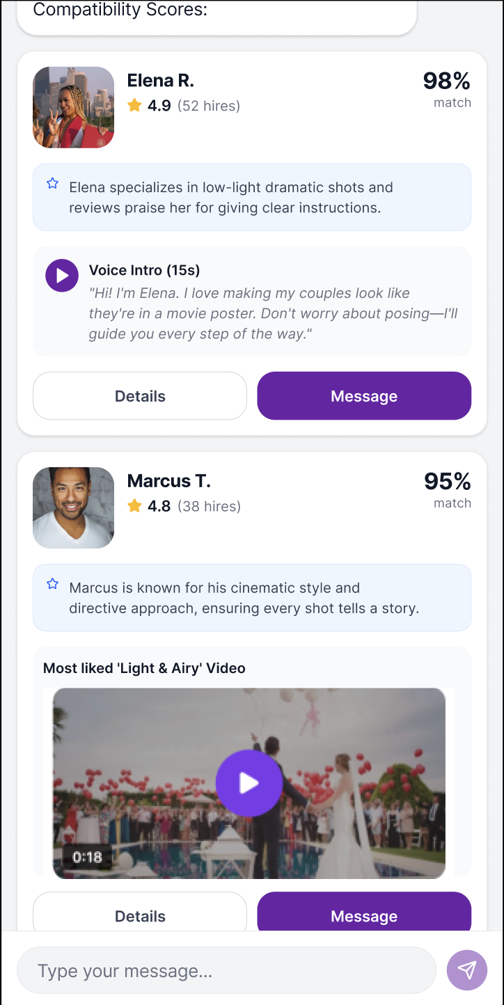
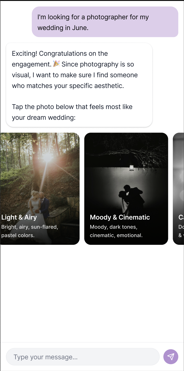
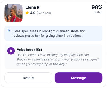
Insight: Creative hiring is as much an emotional decision as a functional one. Users prioritize "creative chemistry" but currently lack the data points to verify it without manual detective work.
Problem Study 1 :
In our user tests, 60% of users echoed the same where they were not confident to just go by reviews, and they wanted to know more about a professional’s personality & style when it came to creative work.
Users felt that they were forced to read between the lines of a bio or a review and look for clues in photo styles to guess a person’s work and personality.
Solution :
Aesthetic Compatibility: Questioning users with aesthetic options to match with right professionals.
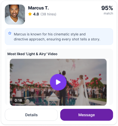
Rich Media Prompts : Watching a relevant video or hearing a wedding photographer’s voice helped the user to judge if they are "high energy/hype" or "calm/documentary style.
Problem Study 2 :
Insight: Volume is being mistaken for value. Users perceive a high quantity of unranked options as "noise," which diminishes their confidence in the platform's ability to provide high-quality matches.
Problem: Paradox of Choices. Early versions of our app gave users too many lists of professionals to scroll through. This caused decision paralysis for users in our study.
Solution :
Limiting the display of matches to top 3 accurate ones and giving provision to show next 3 significantly reduced the decision fatigue. GIving a rich media summary of ‘Why’ the app chose these three profile also substantially helped and improved the decision making.
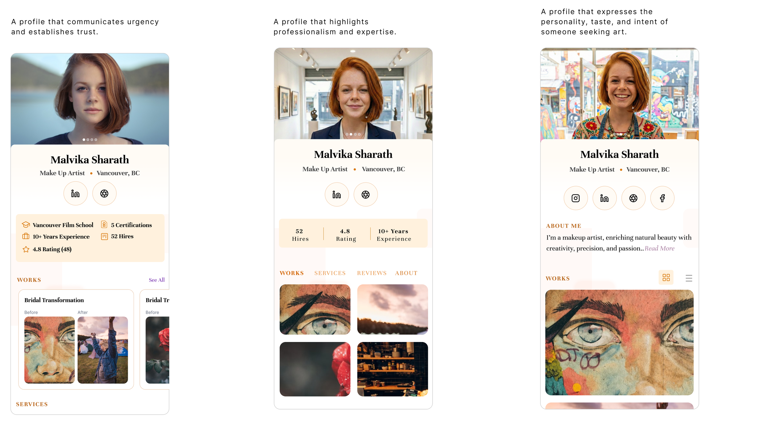
Problem Study 3 :
While the application aimed to match users based on nuanced personality preferences, the UI failed to create immediate resonance. Critical personality indicators were buried deep within the profile containers or constrained by rigid 'area slots,' preventing users from making quick, informed decisions during the initial discovery phase. The lack of immediate personality visibility increased the interaction cost, forcing users to dig for information that should have been used to drive the initial hook of the match.
Solution :
Context-Adaptive Profiles: Implemented a Service Provider photo Tagging System. We required SPs to tag their gallery images with specific personality attributes (e.g., #Adventurous, #Calm, #Analytical). When a user filtered for a "vibrant" personality, the algorithm surfaced specific images tagged as such, creating an immediate visual match between the user's need and the provider's profile
For users showing high-intent/high-urgency signals (e.g., rapid filtering or urgency keyword tags), the UI switched to a High-Density Summary View. This prioritized quick-read text components and key image highlights to speed up the decision-making process. For users in a browsing or exploring mindset, the UI maintained a Rich Media Discovery Layout, encouraging deeper engagement and lazy scrolling to build connection with the service providers.
Problem Study 4:
Chat based onboarding took tremendous amount of time to complete though there was visual progress indicator. While the chat-based UI was intended to feel conversational and human, the reality was a high-friction experience that led to significant user drop-off.
Users were faced with a single, long-form conversational thread requiring over 15 consecutive inputs.
70% Abandonment Rate: The majority of users exited the flow before reaching the final setup stage.
Time-to-Value Delay: The average completion time exceeded 4 minutes, far beyond the user's initial "attention window."
Solution :
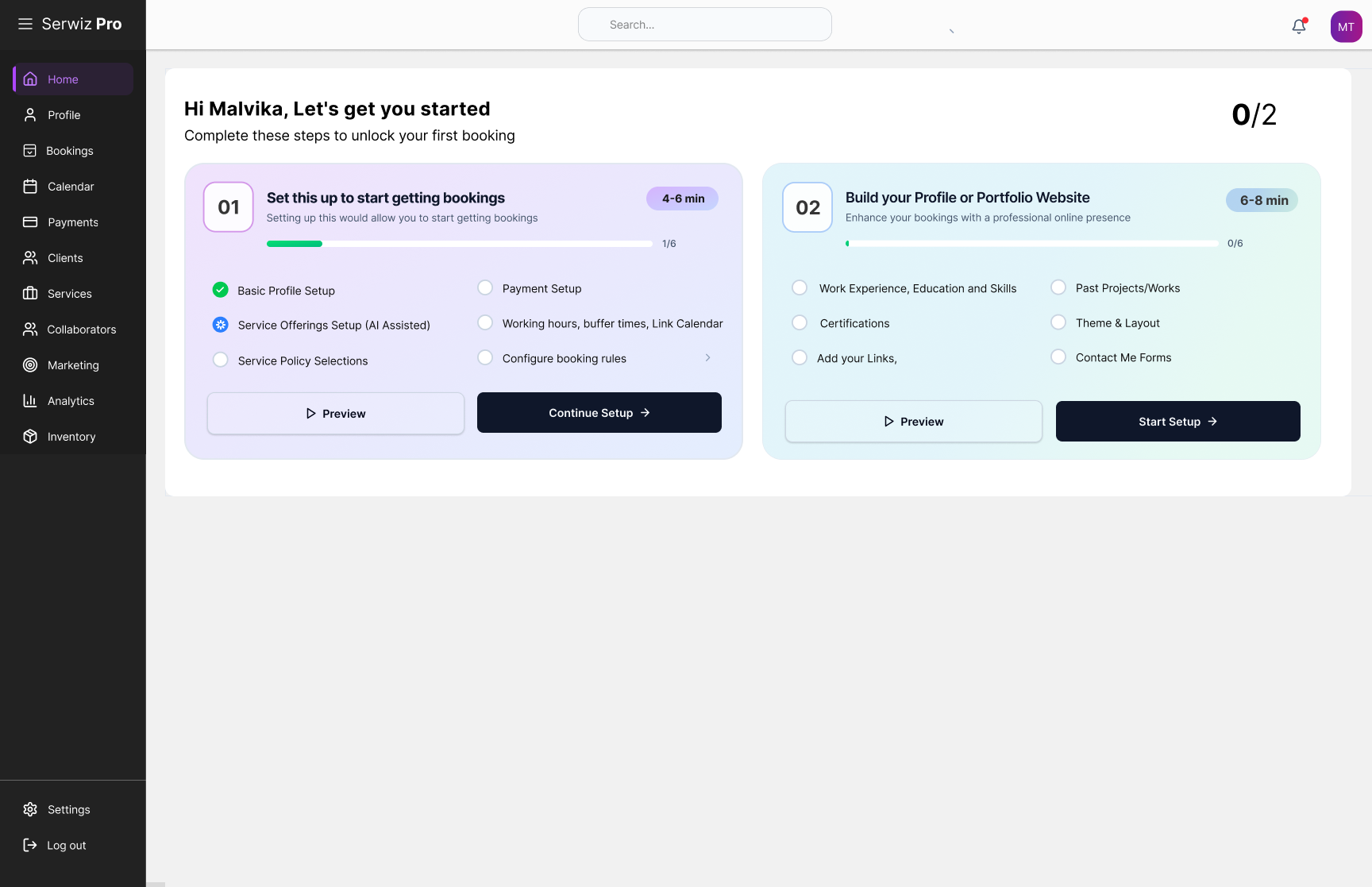
Multi-Phased Modular Onboarding.
Phase 1: Essentials: Name, profession, and location to get the account live instantly.
Phase 2: Detailed Profile: Tailoring the experience based on the inputs from Phase 1 to offer smart suggestions for profile layout, profession related details etc.
Phase 3: Services Setup: AI assisted setup for up all service offering related details, pricing, policy, payments, scheduling etc.
The approach change significantly reduced the Abandonment Rate from 70% to 10%.
Old Approach
New Approach
New Approach
New Approach
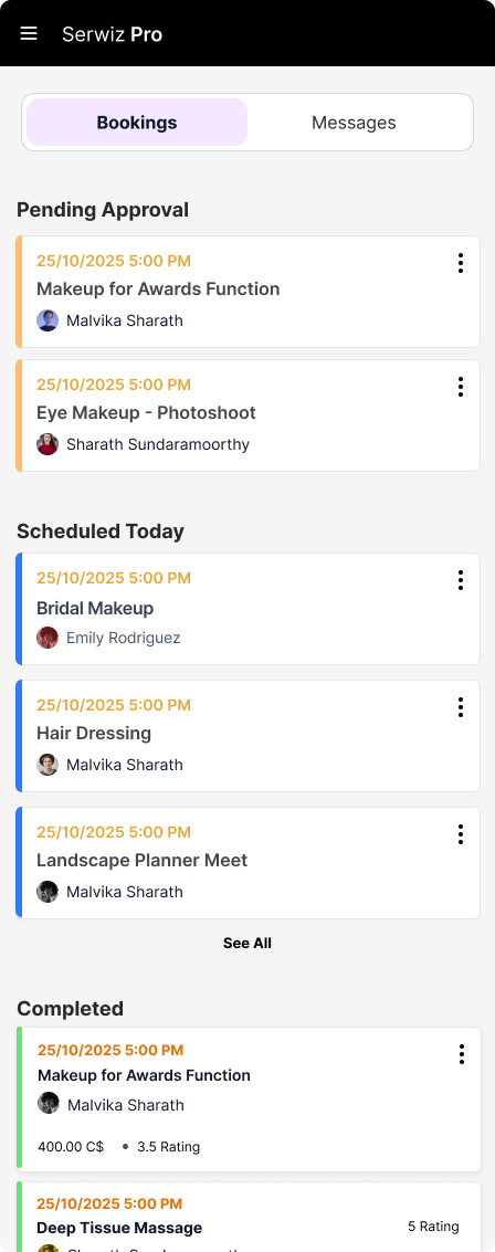
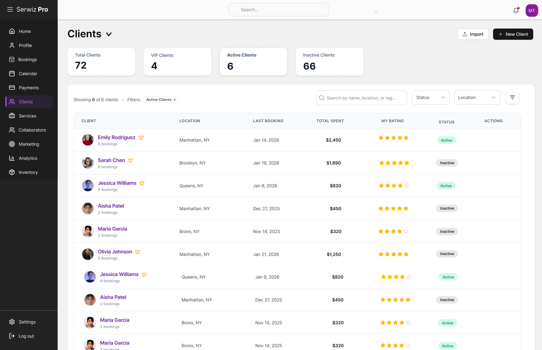
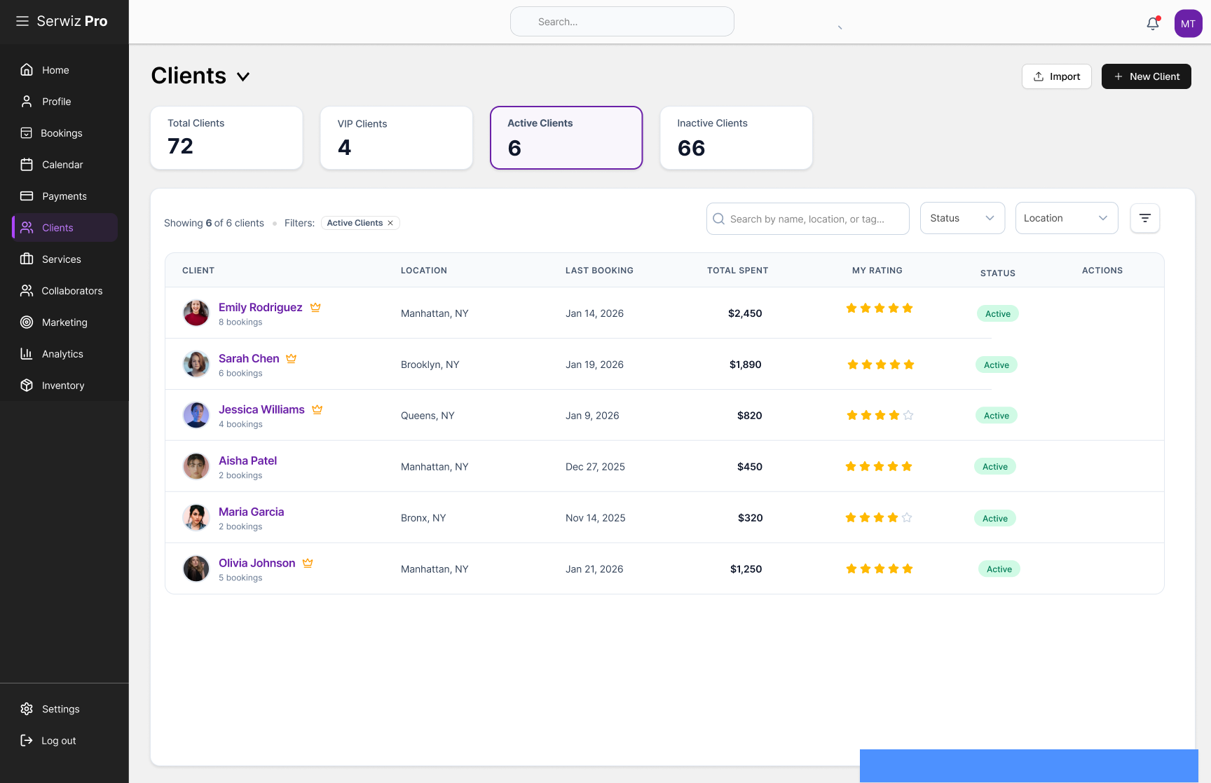
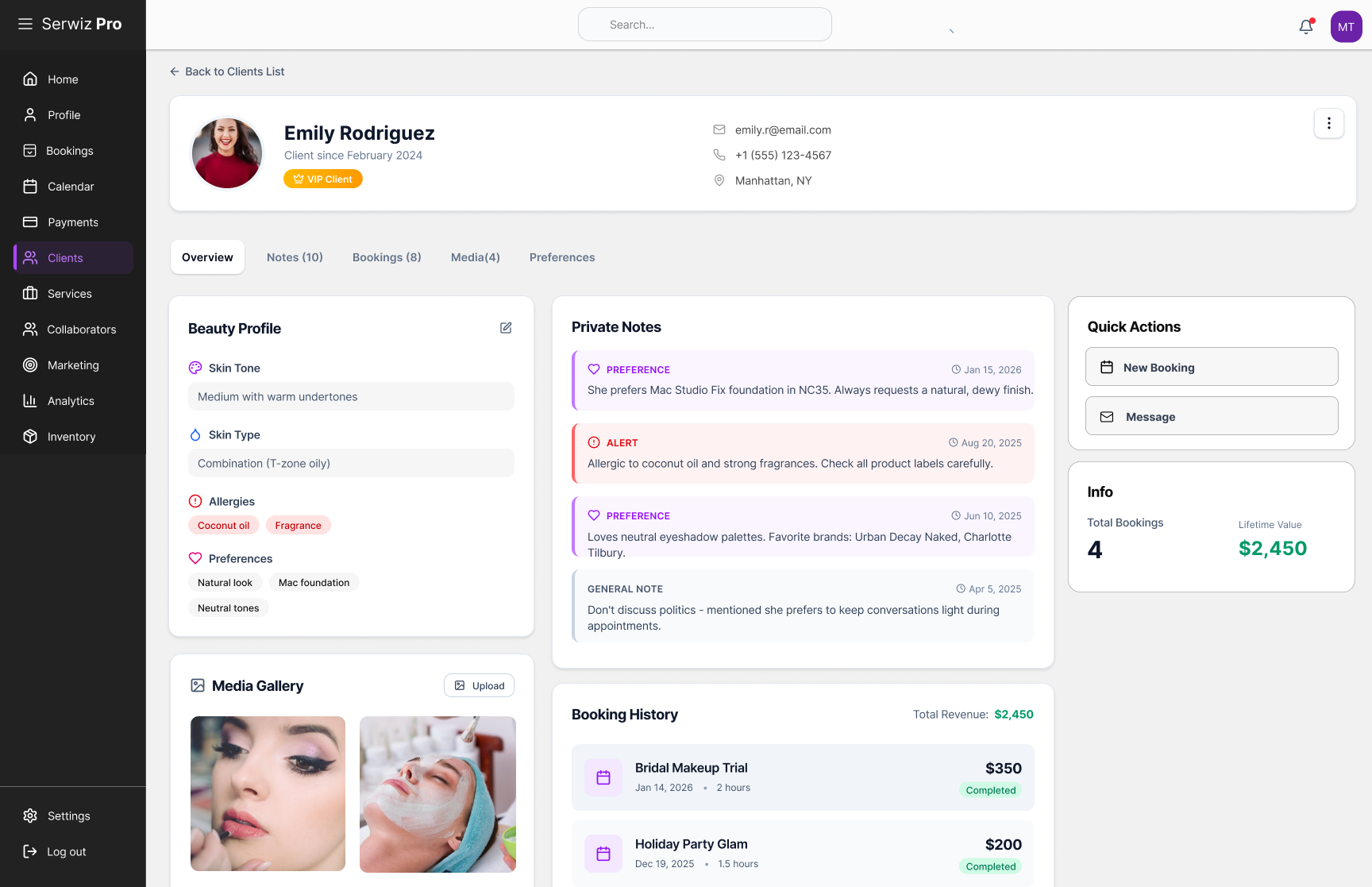
Customer Experience.
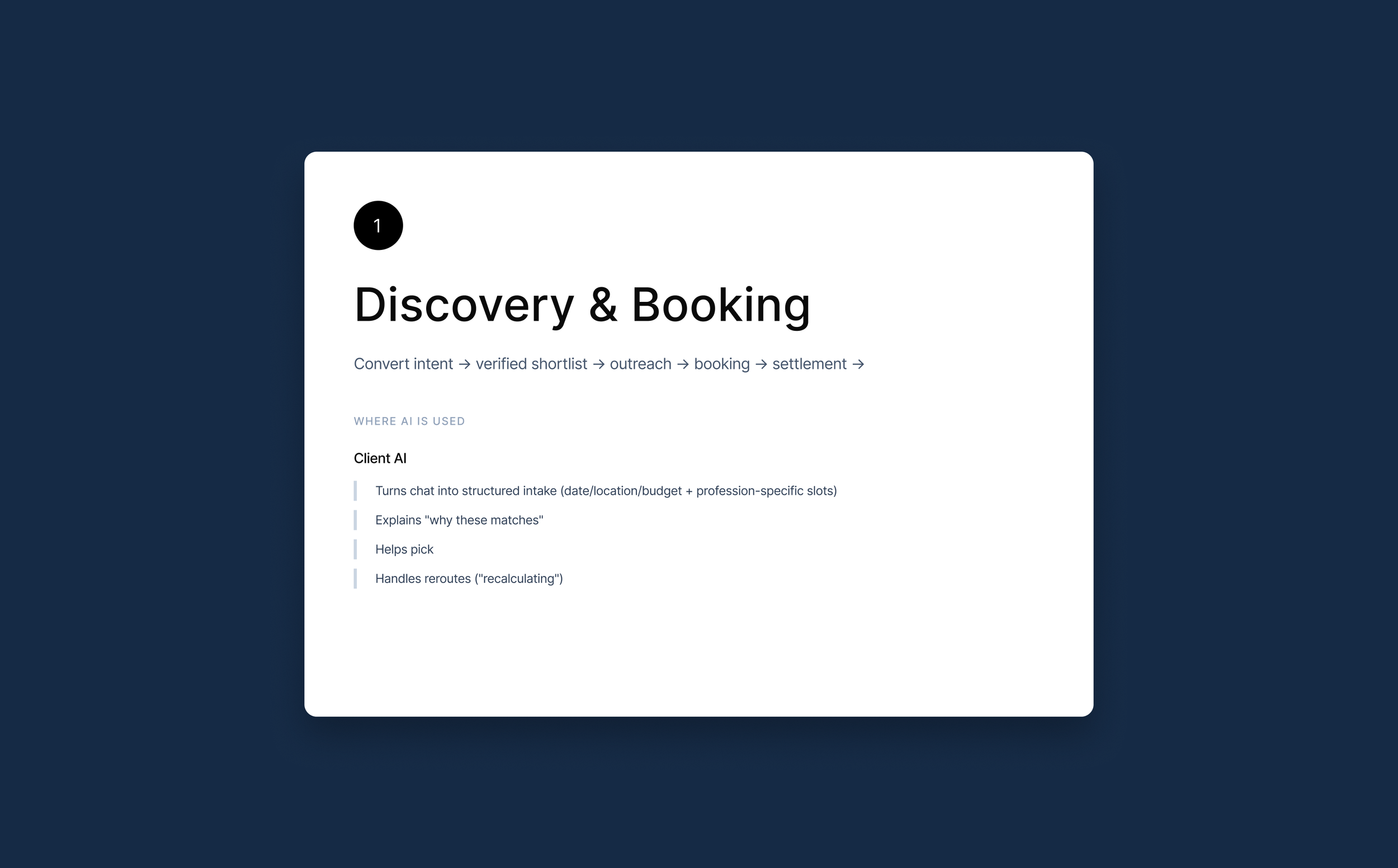
Discover genuine service professionals through precise, intent-driven matching.
Customers, discover genuine service professionals through precise, intent-driven matching.
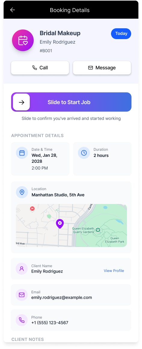
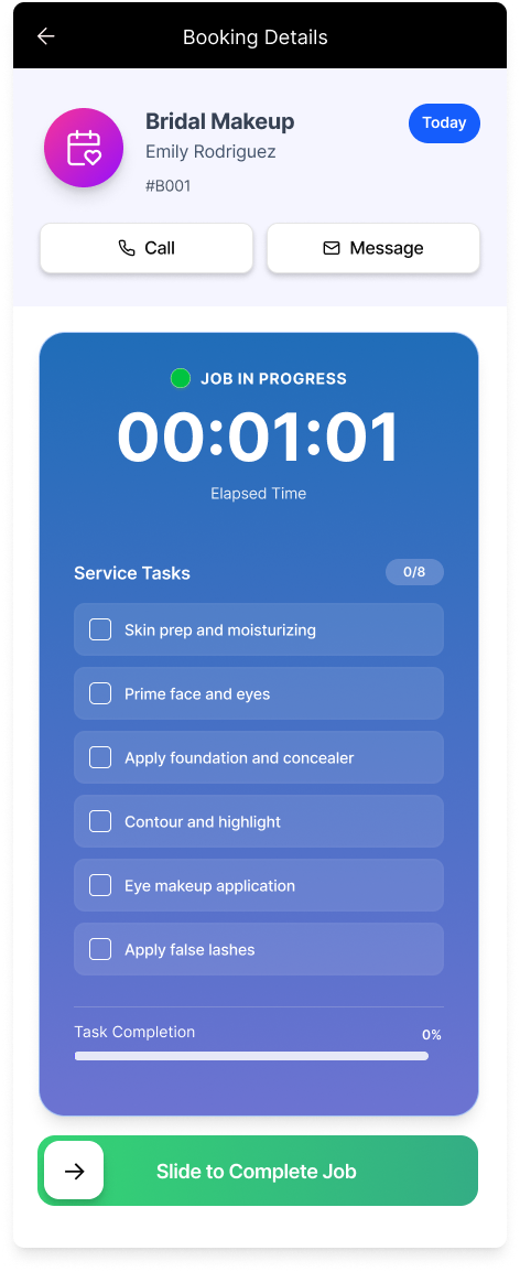
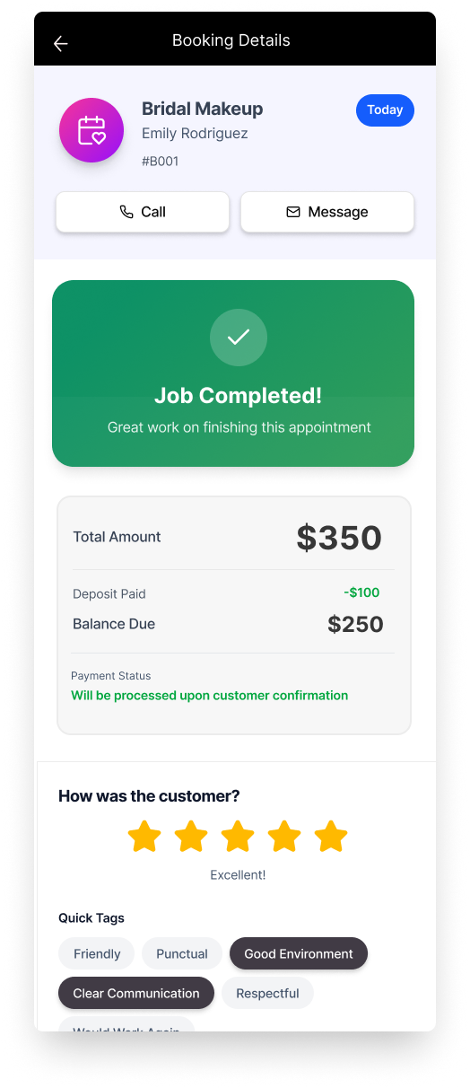
Service Professional Side
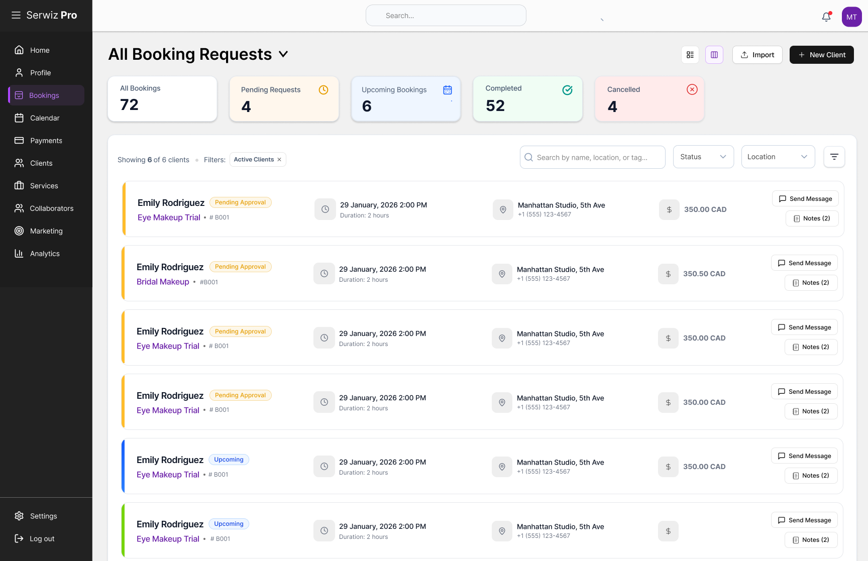
User Testing Results
User testing was completed with people from different demographics and the results were very positive. We used Maze user testing tool to conduct the latest study, with 20 respondents, including service professionals and customers who were looking for service.
Abandonment Rate
Usability Test Results
Design System Architecture & SDK
New age Design System that enables humans and AI perfectly in creating pages aligned with branding, design direction, interaction behavior, and usability guidelines, allowing the SDK to balance adaptive UI development with generative UI.

Creative Vision & Branding
Components & Variables

Code & Data Integration
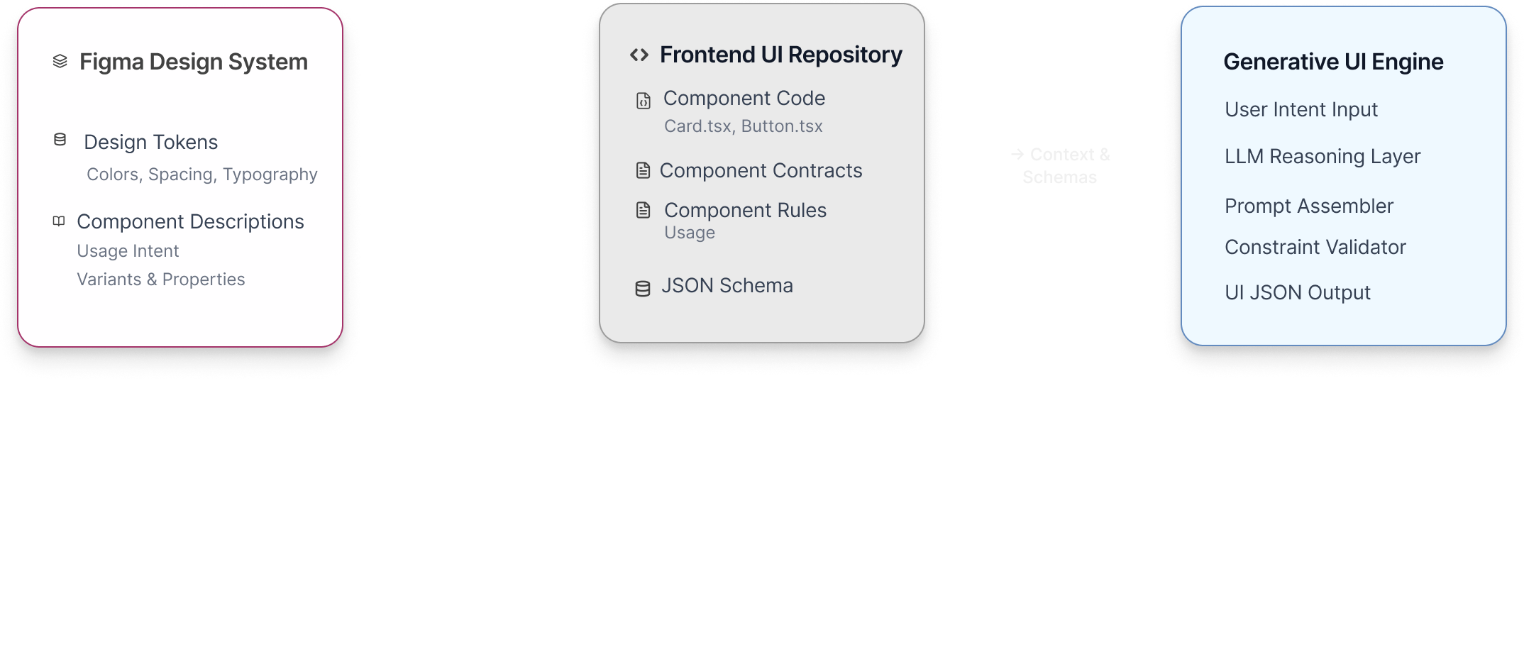
Design Truth + Code Truth + AI Reasoning = Adaptive + Controlled Generative UI